

Let's Talk About Slideshow Design
Photo by Nghia Nguyen on Unsplash
Danielle Fatzinger (@bonniecelt) is the PGR Office Intern and in her third year of a PhD in Celtic & Gaelic at UofG, researching manuscript production in late seventeenth-century Argyll.
PGRs, and academics more broadly, make powerpoints. We do it for conferences, for teaching, for video creation and idea sharing, and even for competitions like Three Minute Thesis. That makes powerpoint design important: the clearer our powerpoints, the more our audience can understand their purpose, and the better we’ll get our message across.
The bad news: if you search for powerpoint design advice online, you’ll find a lot of suggested rules to follow, and some may be contradictory (like use animations VS don’t distract with animations). The 10-20-30 rule. The 7/7 rule. The 5/5/5 rule. The 2/4/8 rule. The 6x6 rule. Which one should be followed? How many points or lines on each slide, and how many words? What about showing evidence or figures? Should design change with the purpose of the presentation?
The good news: Most of these separate rule systems are actually suggesting the same things to consider, just in slightly different ways and with different numbers. The 5/5/5, 6x6, and 7/7 rules are a good example: no more than (5/6/7) lines or bullet points, and no more than (5/6/7) words per line (the 5/5/5 rule also says not more than five text-heavy slides in a row).
10-20-30 rule? 10 slides, 20 minutes, 30 points.
2/4/8 rule? New slide every two minutes, 4 points per slide, 8 words per point.
The neutral news: It can be tempting to pick one of the rules, design slideshows based on that, and call it a day. While that may be necessary at times (life is busy, events sneak up on you, family is more important than Powerpoints, etc), it can also limit what you do with your presentation. Plus, it doesn’t consider some of the most important aspects of design/communication: context, audience, and effectiveness.
So, what do we, as PGRs, do? How do we design? What can we carry with us that will work for any situation? And how do we make it accessible?
Personally, I don’t think the answer to these questions is to follow a strict set of rules, but rather to have a suggested set of guidelines (i.e. design aspects to think about) and guiding questions. This provides flexibility while also encouraging you to include what you need.
Guiding Questions
When designing a slideshow and presentation, preparation is your friend. I like to ask myself questions that, when answered, inform not just what I’m including on slides and how it’s designed, but also the content of the presentation itself. And the questions can be asked when drafting and editing the presentation/script to help refine it.
Who is your audience, and what aspects of your topic do they want to hear about or see?
Academics may want to see more detailed evidence, while the general population will want the highlights in straightforward language. Some professions will want more creative treatment than others like academia (and still others). You may have a different title for a community presentation than a conference. Take time to note who will be engaging with the presentation, or who you want to be engaging with the presentation, and what tone and depth they will expect. You can still be creative or push against the expectations, but knowing them will allow you to do that without affecting understanding.
What’s the best way to visualise those topics?
Do you need a graph, an image, a table? Points or numbering? A diagram? Arrows? If you have a set of points, can they be displayed a little more creatively? Take time to create a storyboard of your script/talking points as they will/can appear on a slide. You can draw it out or test things in Powerpoint (or your slideshow maker of choice) itself, for instance.
How will your slideshow be viewed or your presentation watched?
Watching a presentation on a computer or via Zoom is much different than in a lecture theatre or classroom, and I’m sure we’ve all been in situations where we couldn’t read or follow the presentation because we were in the back and it was impossible to read blocks of text or labels on graphs. On the other hand, presentations on computers, particularly ones you can go through yourself (i.e. without an accompanying talk), can feel a little sparse or be hard to follow or understand.
If you were in the audience, would the slide be helpful and keep attention?
This one is for after the presentation is created. You can enlist the help of friends or family, because it’s hard to place yourself in your audience’s perspective, but give it a try. Do you want the information on the screen? Is it too much, or not enough? Is something distracting? Is something missing? Does everything look so much the same or so crowded that it makes you sleepy? You can record yourself giving the presentation (via Teams/Zoom or with your phone, for example) and then play it back to make it easier to take that perspective.
What powerpoint designs have I seen at conferences that I either liked or disliked?
Learn from others! Avoid things you don’t like (irrelevant images, unreadable text, more than one graph on a slide) and keep the things you do like (readable labels, funny but relevant images, a colour scheme). This will be personal to everyone, so take time to explore what others are doing or look at slideshows posted online. Powerpoint also has a lot of themes and gives design ideas, so you can look through those to find styles that you like.
I’ve revisited an old conference slideshow and changed the designs around. Which designs do you prefer? Do you like any of them? Why or why not? What might you do differently?


Guidelines and Design Principles
I’ve scoured the internet on the lookout for guidelines that come up again and again, which I’ve summarized below.
Basic Design Principles
Design principles not specific to slideshows also work really well in slideshows, so it’s good to familiarise yourself with them. Examples: Contrast-Repetition-Alignment-Proximity (CRAP), Colour, and font. You don’t need to be an expert or recite types of fonts, but knowing these basic principles can help you create the tone and design you’re looking for.
Utilise Your Resources
Powerpoint comes with built-in designs and colour schemes, and it will suggest designs for you. Other slideshow websites and apps will have their own templates. These can improve the look of your presentation without a lot of fuss.
Less is More
When it comes to words on the screen and major points on a slide, you want to include less, and then use the CRAP principles to highlight the most important bits. Even if you need to have a lot of text or something more complex (graph, table), there should be an easy way for the audience to know what they should be focusing on: specific numbers on the table clearly highlighted, arrows or circles to show where on the graph they should look while you explain the importance.
For things like Three Minute Thesis, where you only get one slide, you still want to keep things minimal and avoid clutter: the audience should be able to use the slide to help follow your words and/or your words to follow the slide. Keep it simple.
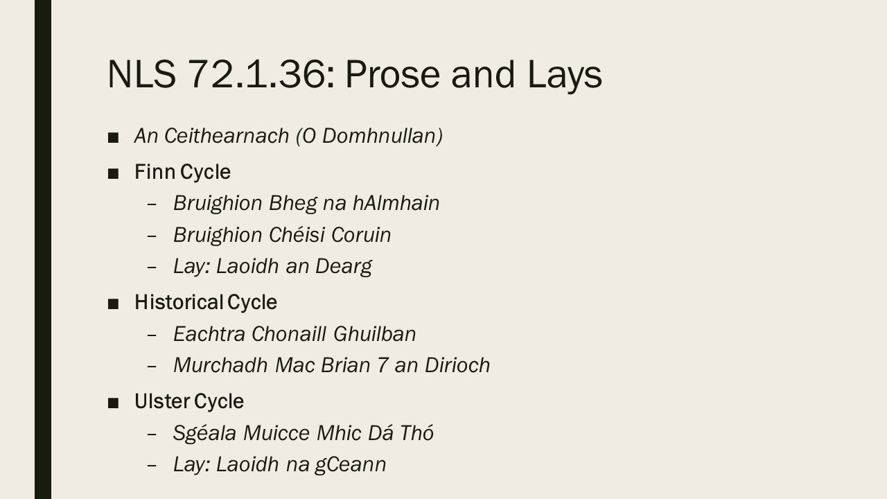
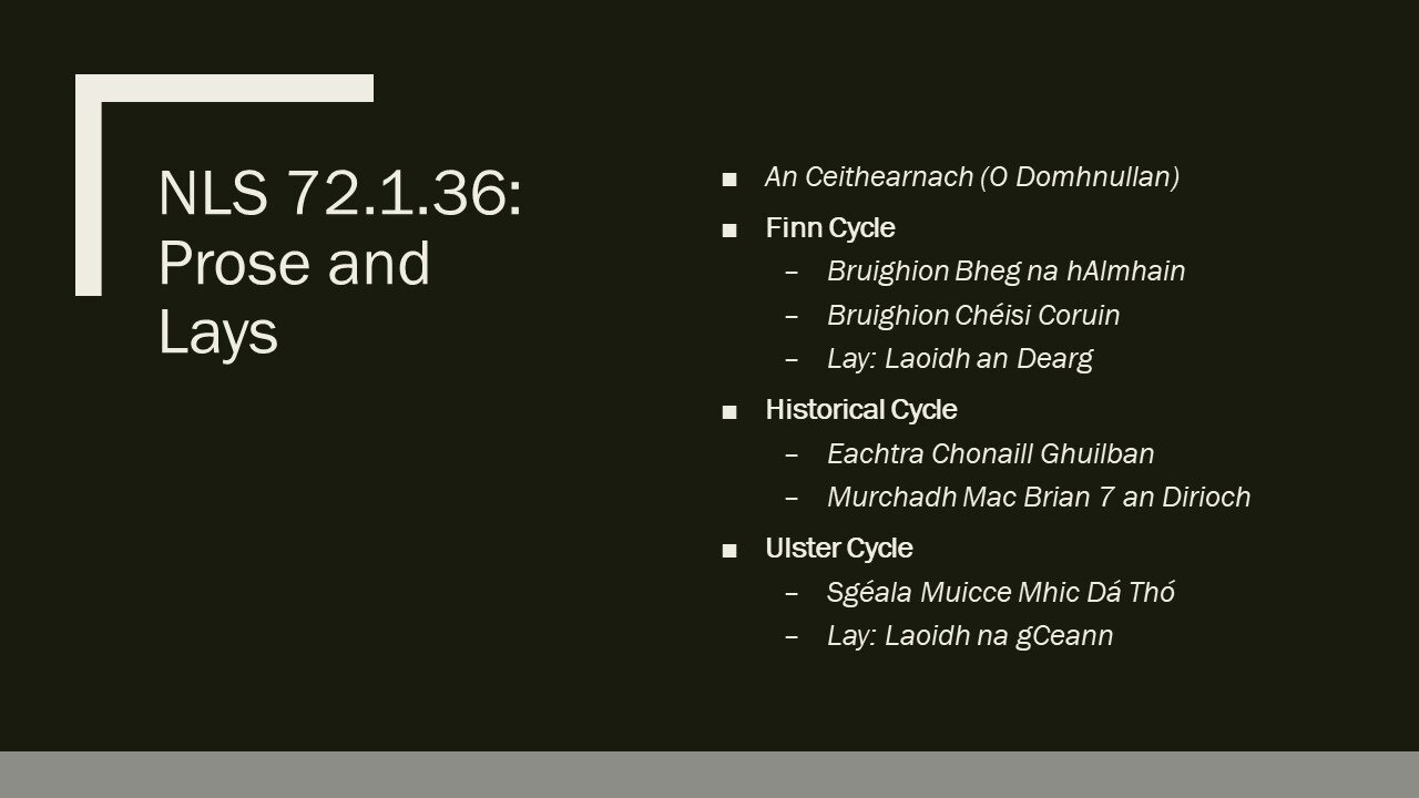
Which one of the below is easier to understand ?
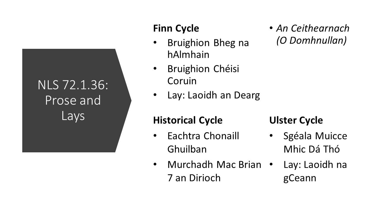
More can be More
Sometimes, better design can come from splitting things up into more slides, to avoid clutter and reduce words on the screen. Plus, more slides means less time on each slide: spending 1 or 2 minutes on each slide during a presentation is recommended.
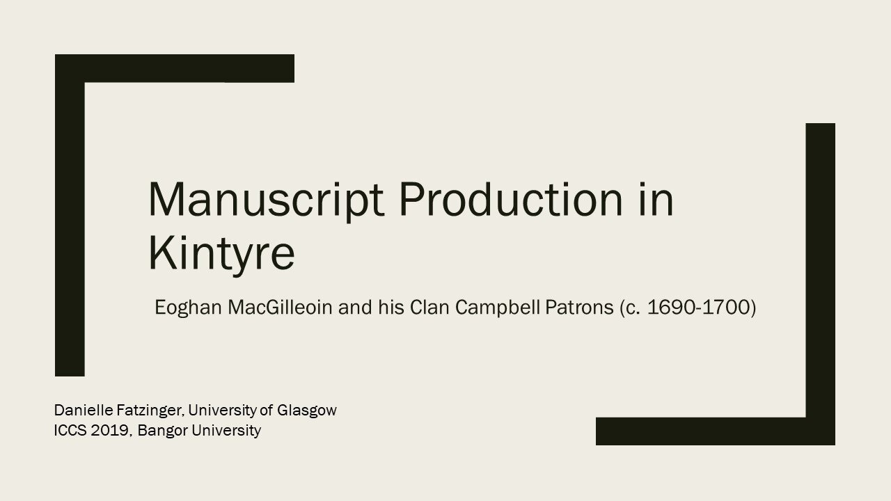
Original Powerpoint slide, with smaller font, more text, and less white space.
More white space can also be better. It means space without any text, images, or design elements, and it can be any colour. Bigger fonts also make your slides easier to read.
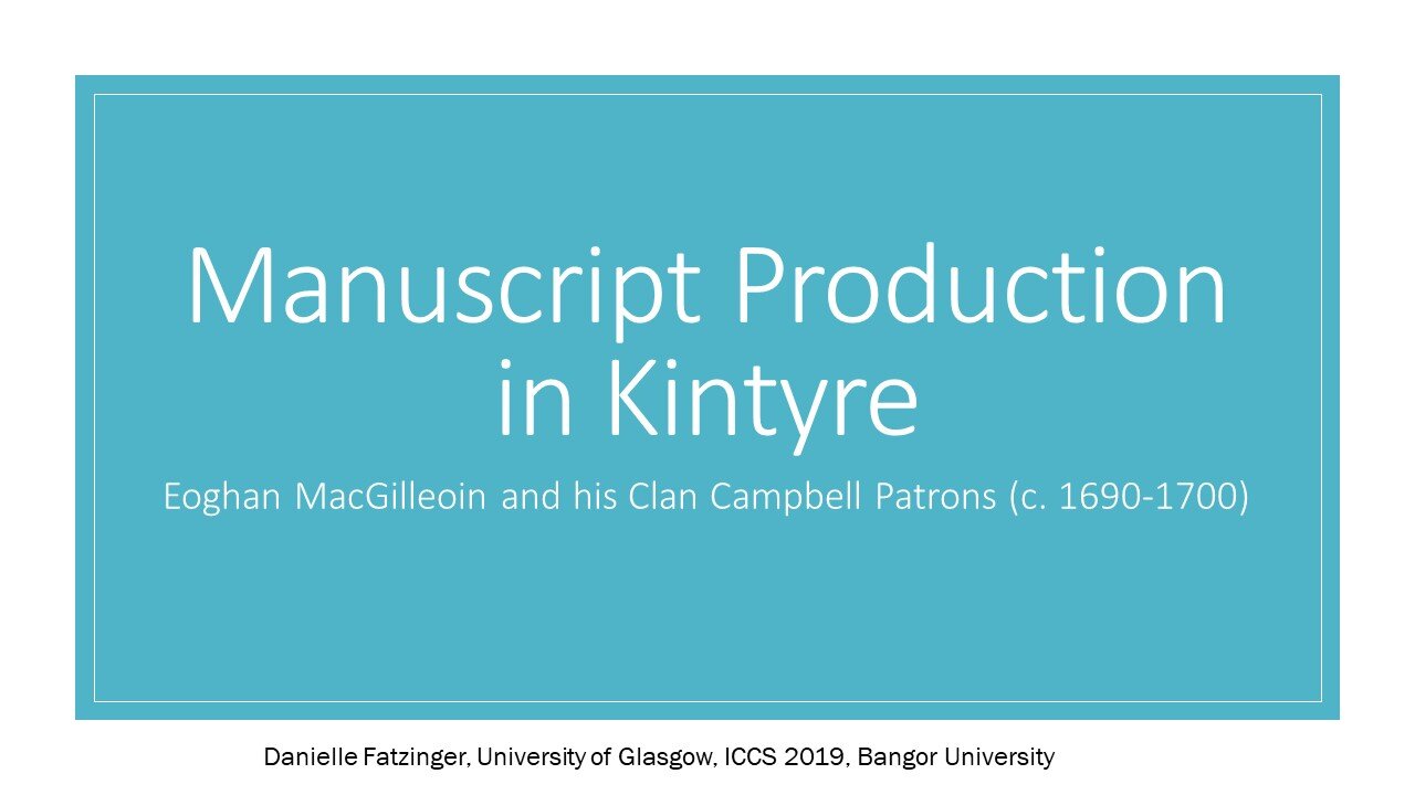
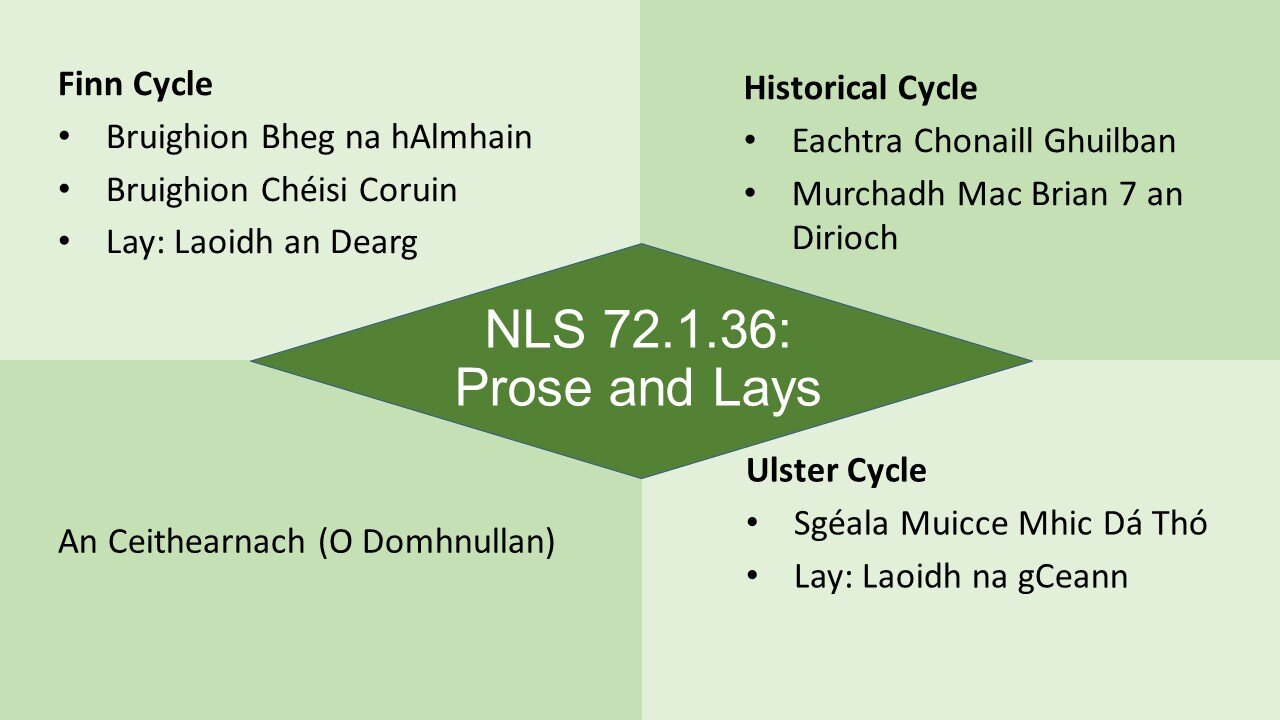
The examples here show the addition of white space, the splitting up of a slide, and the use of bigger fonts.
Edited slide with more white space and larger font.
Edited slide with more white space and larger font.
What advice do you have for slideshow design? Was any of the above helpful? Let us know in the comments or on Twitter @UofG_PGRblog.
Update 27 July 2020: As has been rightfully pointed out on Twitter and in the comments, accessibility is also extremely important, and sometimes, the best way to deliver your presentation doesn’t involve a slideshow at all.

